

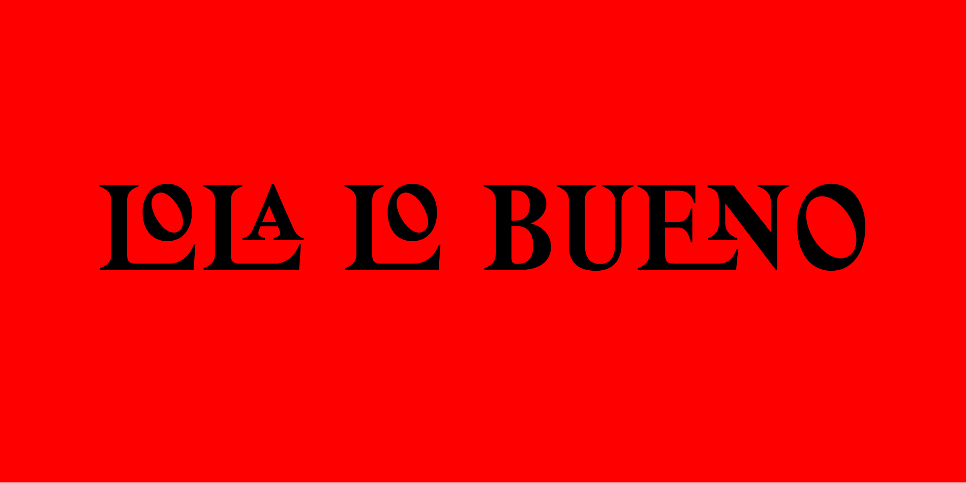
Custom typeface for Lola Lo Bueno, a new Spanish deli.
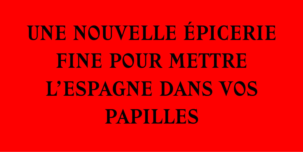
Blanca Pilven created Lola Lo Bueno in 2017 with the aim of promoting Spanish gastronomic culture in Bordeaux. The concept of the shop is that of a friendly place with a grin of madness.
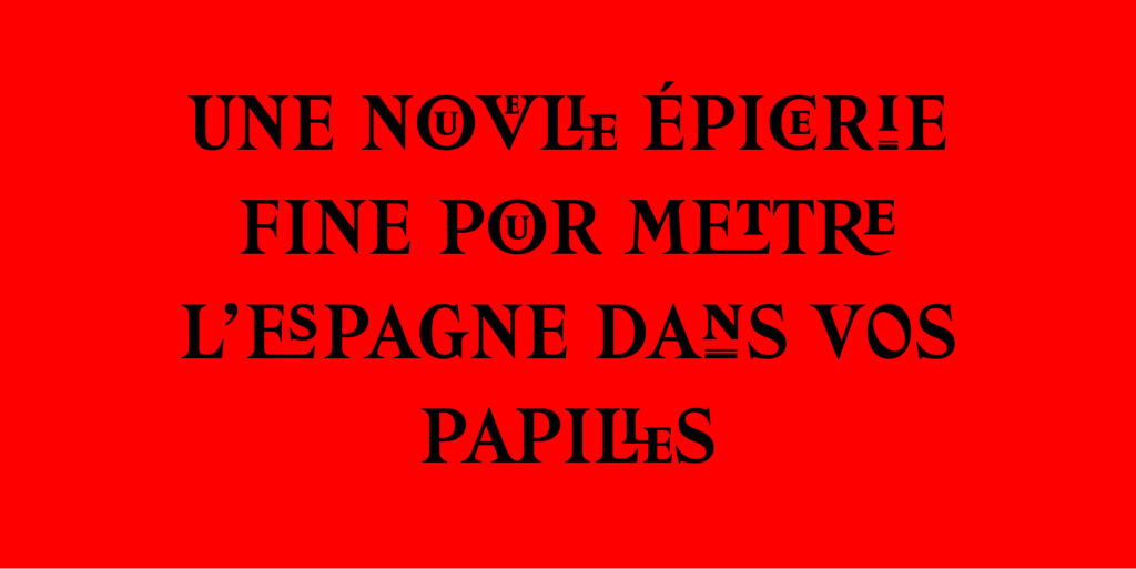
The founder’s request immediately bore on a very typographic identity, composed of numerous ligatures.
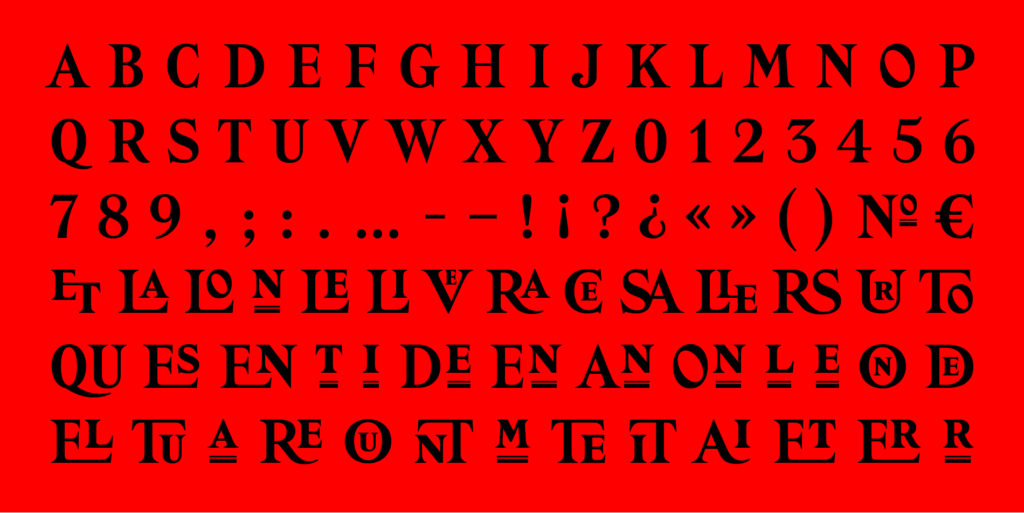
What we offered was to draw from the repertoire of Latin, a category of typefaces with triangular serifs, typical of the late nineteenth century. This style was particularly popular for storefronts in France.
The typeface would therefore have a historical dimension, perfect to establish a certain form of notoriety, to which a dose of eccentricity is added with unconventional ligatures, and an extravagant oblique axis applied to the O.
Historical and eccentric are thus balanced to communicate the confidence and originality of this new brand.